Many times as developers we focus on how to make a websites by planning, creating frames and writings tons of code, but do we really think about the importance of design and usability of websites? For many years this has been a problem for developers and designers, when a client request for a website, we focus more in build a portal that introduce products, services or companies profiles.
But every website have a reason to be build and not all of them have the same goal or target, so this means not all website need to be develop in a same way.
Have you ever consider this points before you build a website?
- The First Impression
- Maintain Consistency
- Visual Images
- Navigation
- Accessibility
Maybe no right?, let me explain you why this points are really important before you build a website and maybe you can have an idea of which way your website should take from now on.
First Impression
You need to ask yourself all of these questions when designing your website. Now, design may not be the most important factor in a website overall and often-times folks put too much emphasis on how a site looks instead of it works, but it does play an important role in making a good first impression.
- Proper use of colors
- Animations, Gadgets and Media Contents
- Responsive Web Development
- Typography

Maintain Consistency
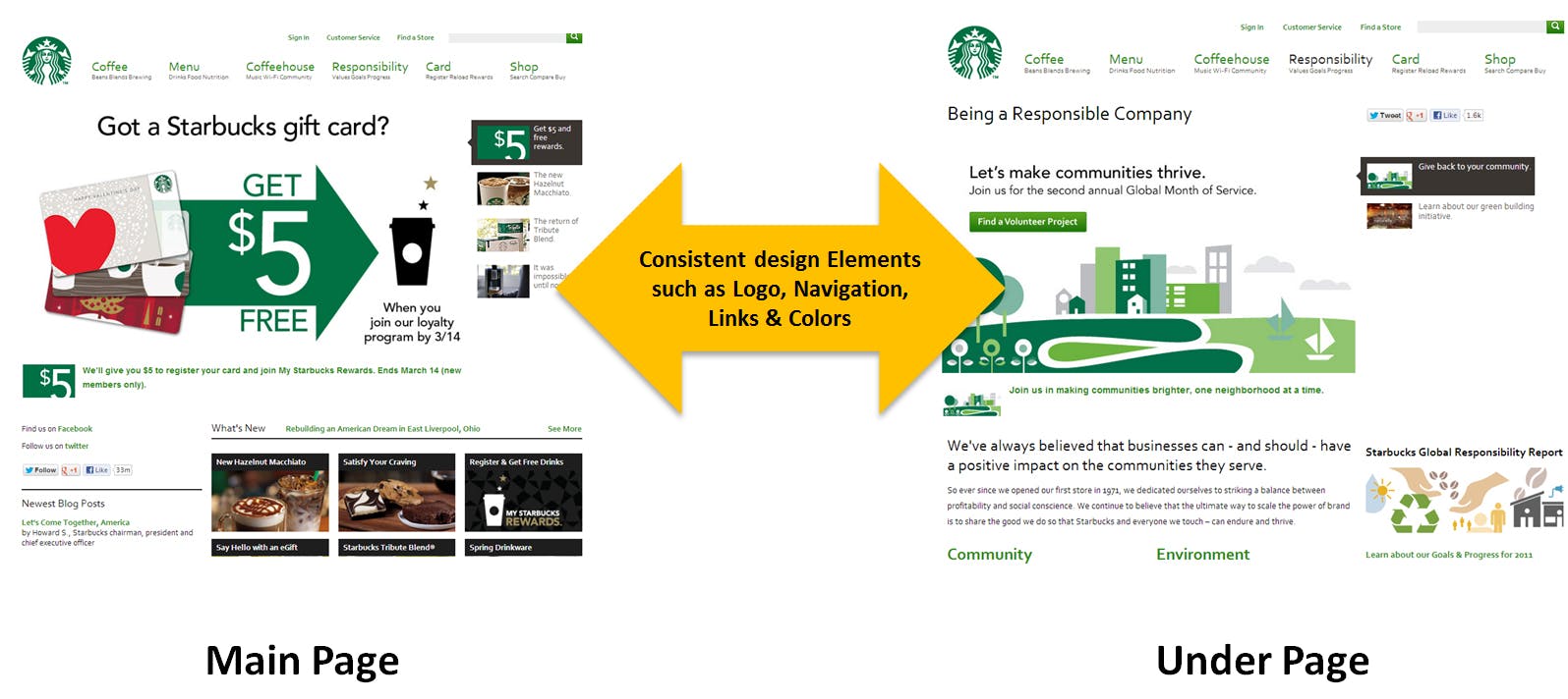
It’s best to keep elements on your site fairly consistent from page-to-page. Elements include colors, sizes, layout and placement of those elements. Your site needs to have a good flow from page to page. This means colors are primarily the same as well as fonts and layout structure. Navigation should remain in the same location of your layout throughout your website.
Visual Images
Marketing Experiments performed a test comparing the use of stock photography verses real imagery on a website and each of their effects on lead generation. What they found was that photos of real people outperformed the stock photos by 95%. Why? Because stock images tend to be irrelevant. Resist the temptation to use photos of fake smiling business people!

Navigation
The overall rule with a proper navigation structure is simple: don’t require visitors to have to think about where they need to go and how to get there. Make it easy for them.
- Keep the structure of your primary navigation simple (and near the top of your page).
- Use breadcrumbs on every page (except for the homepage) so people are aware of their navigation trail.
- Include a Search box near the top of your site so visitors can search by keywords.
- Don’t offer too many navigation options on a main menu, you can always give that option on internal pages.
- Don’t dig too deep – in most cases it’s best to keep your navigation to no more than three levels deep.
- Include links within your page copy and make it clear where those links go to. This is also great for SEO!
- Avoid use of complicated JavaScript and especially Flash for your navigation, keep it simple and easy to visualize.
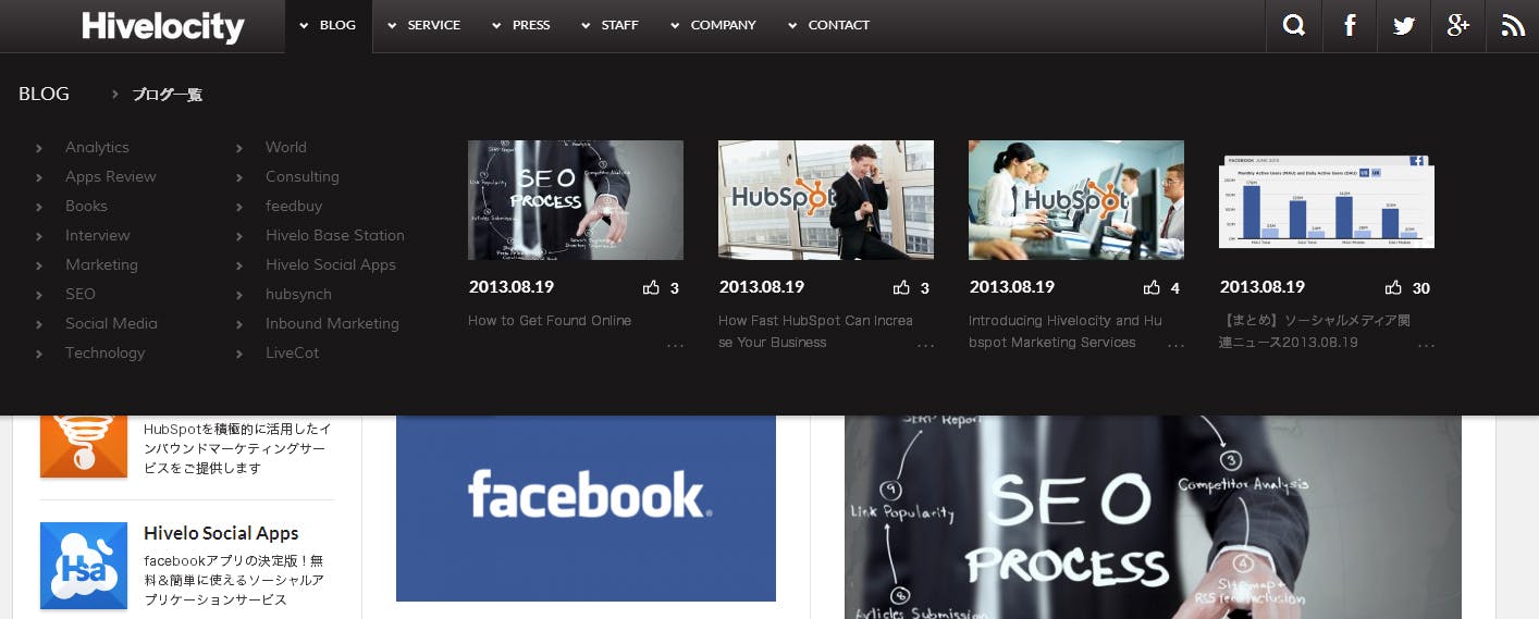
Many mobile phones can’t see Flash (yet), thus they won’t be able to navigate your website. Same applies to web browsers that don’t have an updated version of Flash installed.
Accessibility
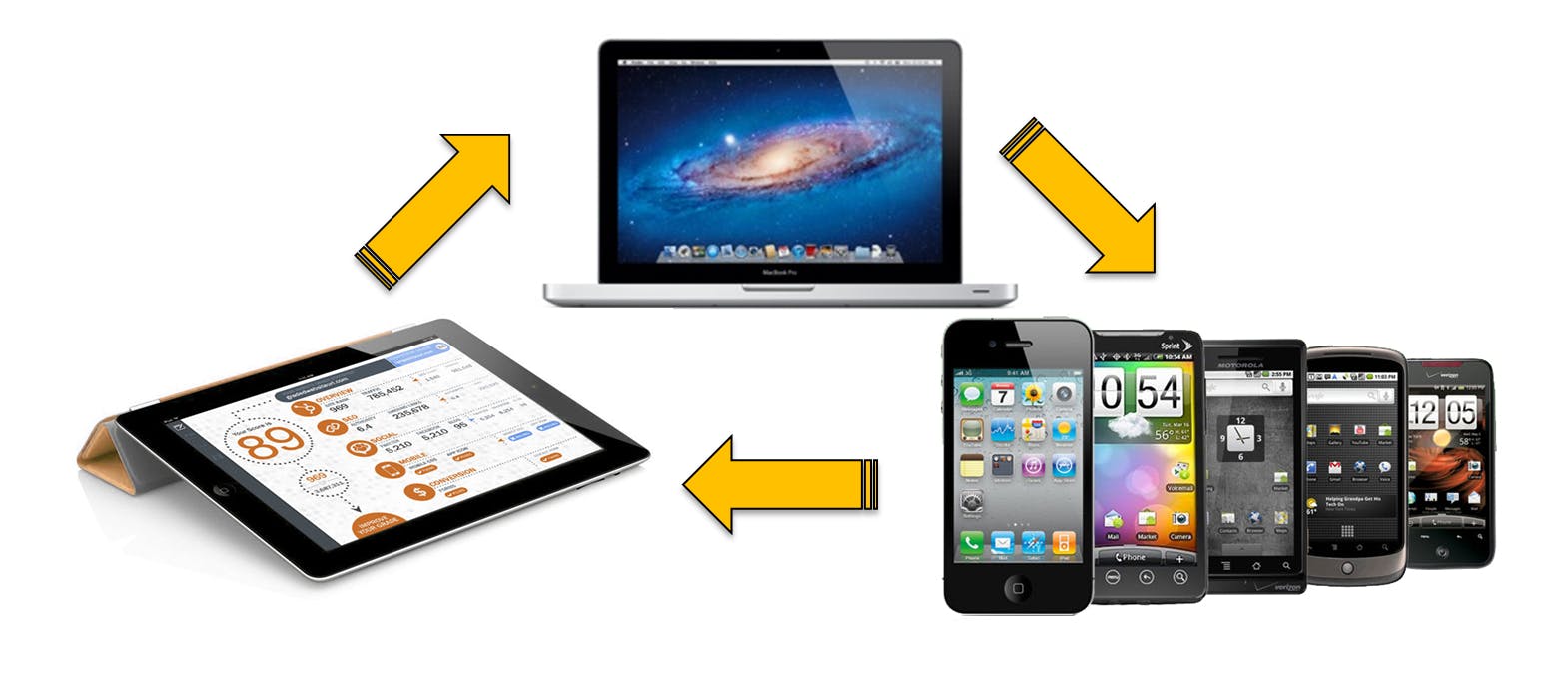
Make sure that anyone visiting your website can view it no matter what browser or application they are using. In order to gain significant traffic, your site needs to be compatible with multiple browsers and devices. With growth in mobile phones and tablet devices, people are surfing the internet more than ever before.
One of the best solution can be a Responsive Design that allows your website be able to see from any kind of devices, this will help to create a significant traffic increasing your visitors and allowing you to have more leads According to the CONTENT and CONTEXT you publish on your website as well.
Ready to make your next move? why dont you start to try Hubspot Today!

